Lock UI Customization
You can customize the appearance of your Lock widget in a few different ways. The best and safest way to do so is with the provided JavaScript options.
JavaScript Options
You can set up a variety of customizations to your Lock via the options parameter when you instantiate your Lock. Some of them allow you to customize your UI. The UI customization options are a work in progress - we expect to be adding more as we go.
First, you'll define the options object, containing whichever options you're wanting to customize. Then you'll need to include that options object as the third parameter when you instantiate Lock; more on that below.
Theming Options
There are a couple of theming options currently available, namespaced under the theme property.
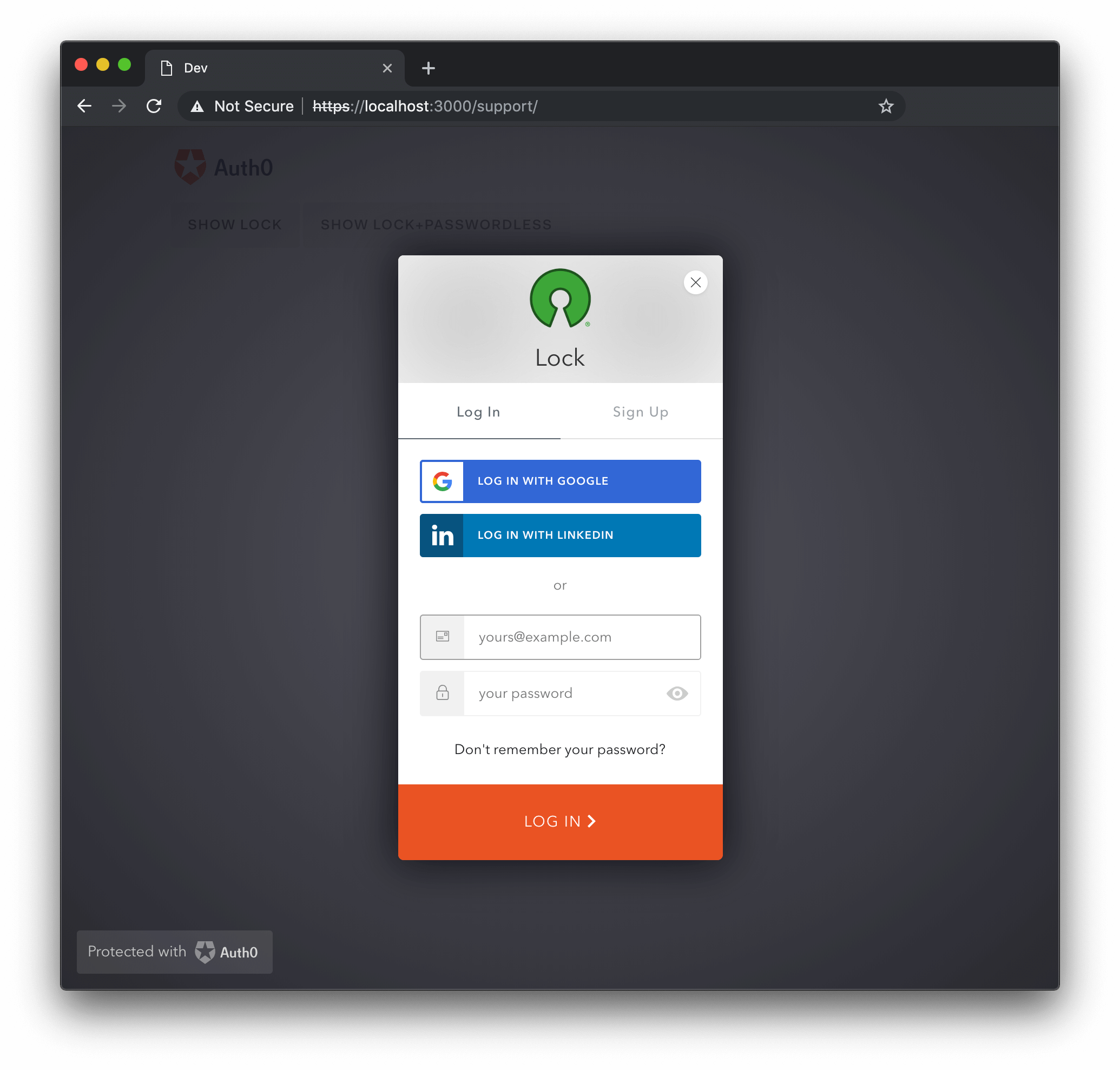
logo {String}

The value for logo is a URL for an image that will be placed in the Lock's header, and defaults to Auth0's logo. The minimum recommended resolution is 200 pixels (width) by 200 pixels (height).
var options = {
  theme: {
    logo: 'https://example.com/logo.png'
  }
};
Was this helpful?
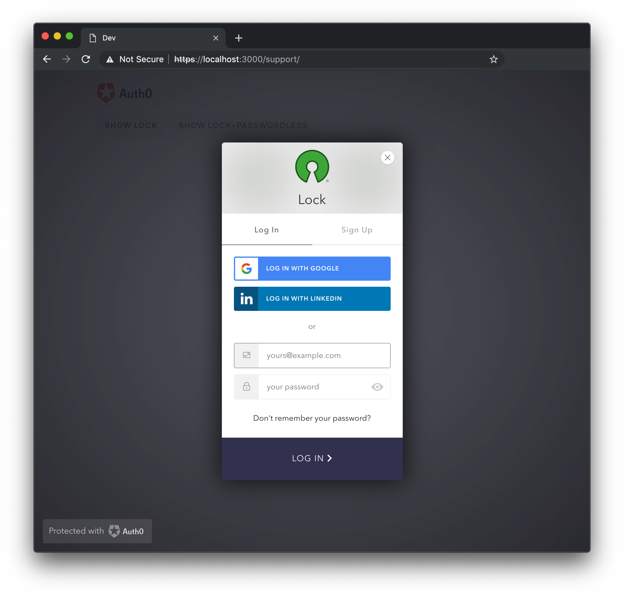
primaryColor {String}

The primaryColor property defines the primary color of the Lock; all colors used in the widget will be calculated from it. This option is useful when providing a custom logo, to ensure all colors go well together with the logo's color palette. Defaults to #ea5323.
var options = {
  theme: {
    logo: 'https://example.com/logo.png',
    primaryColor: '#31324F'
  }
};
Was this helpful?
authButtons {Object}
Allows the customization of buttons in Lock. Each custom connection whose button you desire to customize should be listed by name, each with their own set of parameters. The customizable parameters are listed below:
displayName {String}: The name to show instead of the connection name when building the button title, such as
LOGIN WITH MYCONNECTIONfor login).primaryColor {String}: The button's background color. Defaults to
#eb5424.foregroundColor {String}: The button's text color. Defaults to
#FFFFFF.icon {String}: The URL of the icon for this connection. For example:
http://site.com/logo.png.
var options = {
  theme: {
    authButtons: {
      "testConnection": {
        displayName: "Test Conn",
        primaryColor: "#b7b7b7",
        foregroundColor: "#000000",
        icon: "http://example.com/icon.png"
      },
      "testConnection2": {
        primaryColor: "#000000",
        foregroundColor: "#ffffff",
      }
    }
  }
};
Was this helpful?
Customizing Text
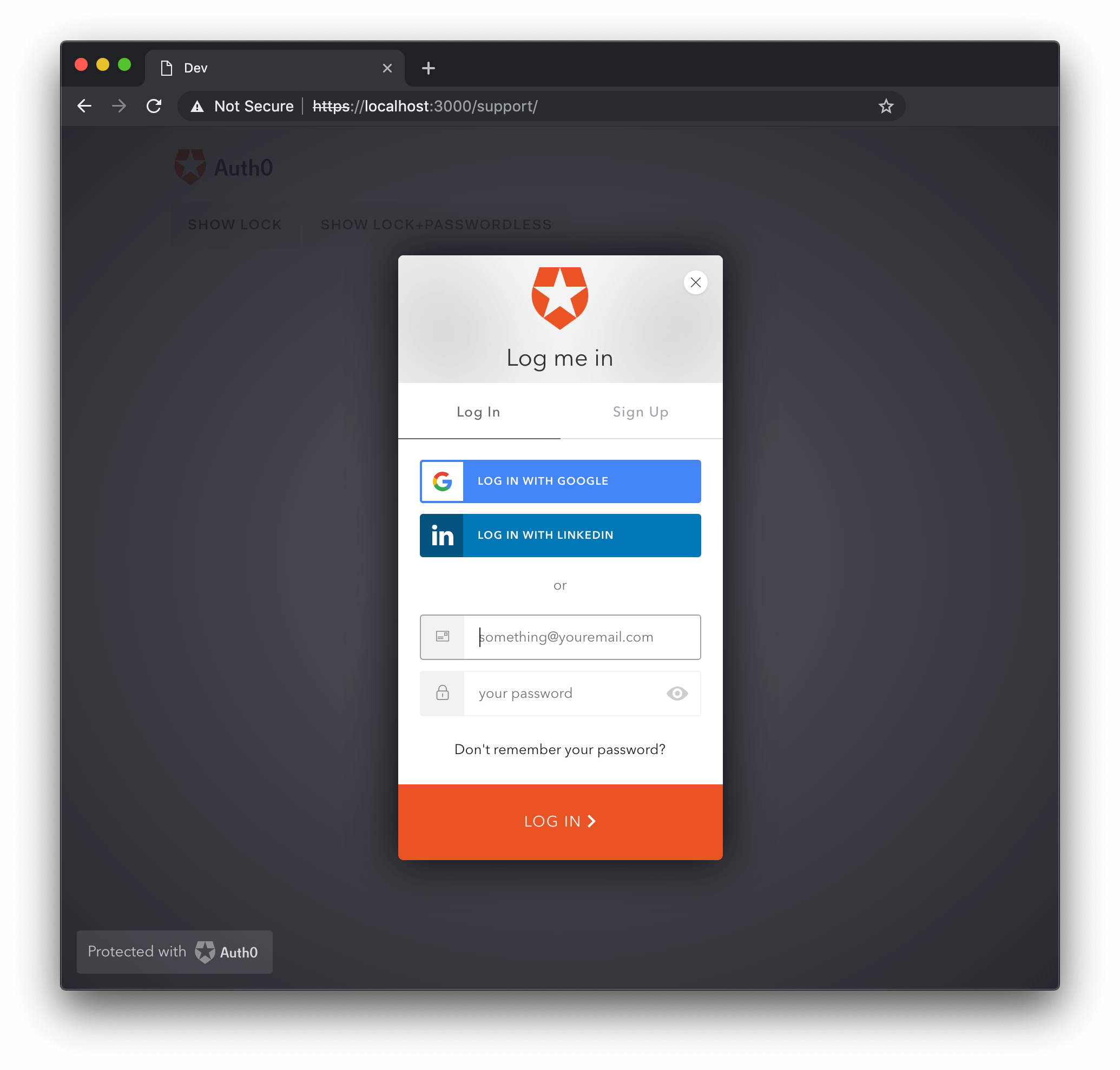
The languageDictionary option allows customization of every piece of text displayed in the Lock. Defaults to {}. See below for an example.
var options = {
  languageDictionary: {
    emailInputPlaceholder: "something@youremail.com",
    title: "Log me in"
  },
};
Was this helpful?

For a complete list of the items able to be customized using languageDictionary, see the English Language Dictionary Specification in the repository.
Instantiating Lock
Finally, you'll want to go ahead and instantiate your Lock, with the options object that you've defined with your custom options in it.
var lock = new Auth0Lock('{yourClientId}', '{yourDomain}', options);
Overriding CSS
Customizing your Lock by overriding its CSS isn't recommended. The issue is that with new releases of Lock, some styling may change, leading to unintended problems if you are overriding the CSS. Additionally, it's possible to simply overlook use of styles in other places and while the change may look fine in one view, it might not in another.
If you still intend to override CSS to further style your Lock, we recommend that you use a specific patch version of Lock rather than a major or minor version, so that you limit the amount of unexpected results that may occur when you alter the styles, and then another patch is deployed that might cause unexpected behavior in your UI due to the changes. This can be done by ensuring that you specify that patch version (x.y.z) when including Lock, or downloading it.
Additionally, we of course recommend that you test your CSS changes exhaustively, to ensure that the experience is the one you intend it to be for your customers.
Further Information
If you're looking for more detailed information while working to customize Lock for your application, check out the configuration options page or the Lock API page!
If you have specific theming options that you would like to see added, let us know. We are working on improving the customization options that are available through JavaScript, and this list will be updated as new options are added.